Charts
The presentation of an indicator is consistent throughtout the dashboard. It carries all the necessary information to understand the indicator and its value. It also includes tools that are adjacent to a graphical chart such as downloading the data used to generate the chart, etc.
Types of Charts
You may encounter various chart types depending on the data:
- Bar Charts: Comparing values across different areas (e.g., Households Enumerated by County).
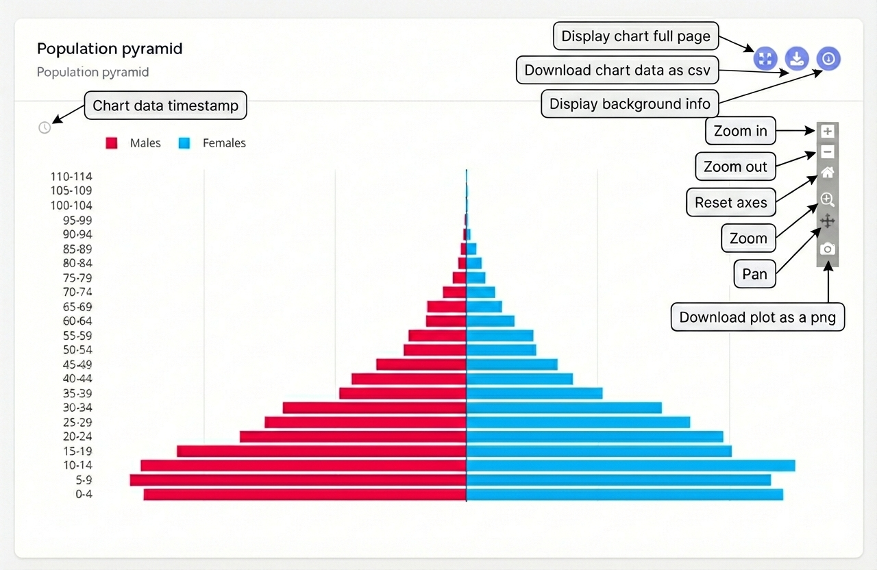
- Population Pyramids: Showing the age and sex distribution of the enumerated population.
- Line Charts: Tracking progress over time (e.g., Daily Enumeration Rates).
- Pie Charts: Showing the distribution of a variable across different categories (e.g., Ratio of male and female population).
Exporting Data
Most charts allow you to export the underlying data. Look for a "Download" icon on the top right corner of indicator cards.